Sunday, 21 March 2010

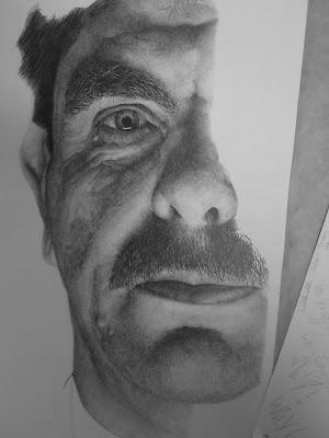
above is the last stage in the drawin that i shall show you as im am currently working on this piece. I shall put it one once completed... Below are some useful links to working with hair!!
Please can you email wjlacey@live.co.uk to let me know what you think and/or if this tutorial helped. I am wide open for criticism and wish to learn from my mistakes etc. If you want to know more about me check out my deviant art wjlacey.deviantart.com or add me on Facebook ill be more than willing to answer questions by any of these methods. I am also on http://www.conceptart.org under the username wjlacey, Behance, Creative Stem, Artpapa, Wetcanvas etc. Should you wish to contact me on Face book, search my name Wesley Lacey, from Sheffield England... Thank you Very Very Much!!!
To do the lightest parts of the skin, don’t just leave the part black. There are no perfect white pars on a work other than a highlight. Even then, some of the highlights can sometimes be not fully while. Try not to use an eraser to lighten the parts after going dark. First work up in layers until you get your desired value. Should it be way too light, then refer to using the eraser, but only use in emergencies, an if you’re going slow, this shouldn’t be too much to worry about... the reason i say this s because i have found that erasing never seems to leave the part you erased the same. I alters how the graphite interacts with page.
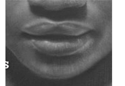
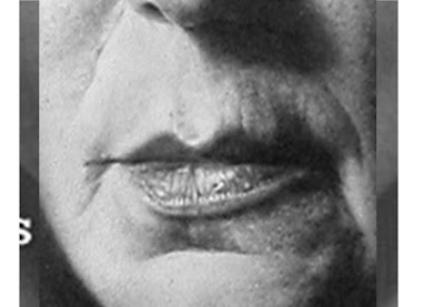
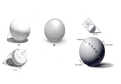
To draw lips there are many different ways. To my immediate right, is a crop of one of David Kassan’s drawings, and bottom right is Armin Mersmann’s. Both done very differently. Kassan has blended them in to make them appear much softer, and once again, sometimes less is more in terms of details. Both are women’s lips, maybe Armins being slightly less flattering. However something you notice on both... there are no lines. They haven’t drawn any lines to show wrinkles. They have rendered them in and felt the surface. That is something many people fall into the trap of... they se a wrinkle and draw it as a line, however its not a line at all, its where light doesn’t hit. If the light is coming from above, as in these two, the upper lip will cast a shadow over the inner part of the lower lip, and once again a shadow more subtle on the lower part of the lip, which curls around an faces away from the light. Studying light falling on a sphere will really help yur understating on this.


As I have already stated, this game is all about patience. Also perseverance. And great work ethic. Just as muscles only increase when you push them beyond your normal limit, to get better at anything you have to push and learn. You have to envelop yourself in what you’re doing 100%, and be present to the moment. You have to feel the skin and bumps. The surface and the hair. Where the light hits and the darks begin. You simply cannot work and get better by simply going through the motions.
Here (in the two images right) I have just carried on doing more mini drawings within his cheek. Like for example. The pupil... it’s easy to draw a black circle and a grey part around the inside, but you have to try and feel its 3-dimentionality. It’s a lenses and the pupil isn’t a 2-dimentional circle. With a black line round the edge. You have to work the image out as well as look at your references.
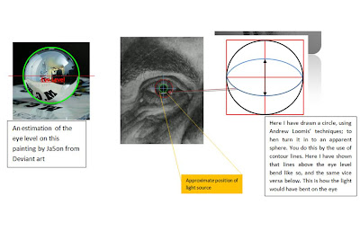
The light is coming from below as you can see, and very close to his face. I used a strip light (the kind you see on ceilings) which has made the highlight in his eye rectangular, but have tried to form the highlight round the near spherical boll of his eye. (Visual explanation below).
The Iris should be dead in the centre of the pupil and the pupil on the eye ball.


Next I thought I would add in some sort of surface crack so you can see also how it can be done. First I drew the line how I wanted, not very realistic however, as many rocks split differently so it would be up to you to research. In the mean time keep working in the mid-tone by layering up.
- Work the line in and try envisioning from where the light is coming from so that you can imagine where it might hit the edge. Seen as in this drawing, the light is coming from the upper left therefore the light would be on the side of the crack facing the light which happens to be the bottom right side of the line in this drawing.
- I know the references may not be perfect, however, can you notice that the centre of the large circle is smoother? What I did was lay down the graphite but lightly drawing shading in on direction then blending in one direction, this gives a smooth effect. I used a cotton bud to do this. I also wanted to have the middle lighter.
- Below is a small diagram of the unfinished work. It’s to try and show you where the light source is coming from. This is the reason I used circles as it is easier to see where the lines from the light source, kiss the edge of the circles drawn. The lightest part of the highlights are the ones in the centre of the two meeting the edge, (here shown as a black dotted line) this is because it’s the small part which is directly facing the light source.
- As you can see with those dots i drew earlier, i have begun to tirn them into three dimentional lumps. Obviously the larger the detail is, the more detail it will hold.
- And lastly, just finishing off small details, rounding off edges a little and refining parts.


Drawing a Pits and pours etc (Details)
Ok so this takes a little bit of understandings. Right is a quick simple visual explanation of what you do. As we know, skin isn’t like we see in magazines movies of ‘perfect’ soft skin. Even babies have blemishes and moles, funny hairs that don’t seem to fit into its surroundings. Airbrushed skin is what I would call an invention for flattery. Mainly to flatter women. Do you think Nicole Kidman would be happy if she had a big juicy spot one day and the photographer ‘left it in’? She would probably want to sue the guy (or lady).
Many artists work in the realm of drawing airbrushed looking skin. The realists who study in Ateliers and classical training art schools for example don't draw every knuck and cranny and pit and pore, however that’s a completely different kind of work all together in my opinion.
- Step one- (image right has had to be darkened and altered to be able to be seen on this monitor). I’m just going to show you some shapes in a basic for so that you can get the idea. First lay down a very light outline of what you want to do. In this case I’m doing two circles. One will be a hole, and the other will be a circle with a kind of gap around.
- I am using a continuous circulism technique for the back ground, just continuously drawing little interweaving connected circles without taking off my pencil.
- Build up layers rather than going straight for your chosen value.
- Next add the darkest darks and leave the lights black, therefore you are distinguishing the darkest and lightest part with a mid-tones for the base.
- Work in slightly darker areas around the highlights, this will enhance their brightness on the page.
- To add small pours, which could be used for skin, rock, rough wood, or whatever else you could find the techniques to work with. This is one way, next to a little dot of light you may have left by accident on the paper; draw a dark spot next to it, on the side of the mini light spot as where the direction of light is shining. For example, if you want it to be a bump coming out, draw the dark spot where a mini shadow would be cast. Or you can draw a spot onto a mid-tone and erase a highlight using you putty eraser.


